If you walk into a newly renovated home today, you will notice a massive shift. The cold, sterile “hospital-chic” look that dominated the early 2020s is officially on its way out. Homeowners are tired of living in flat, colorless boxes that offer zero emotional warmth.
When we consulted with clients during our recent design projects, the complaint was almost always identical: “Our space feels bright, but it feels completely dead.”
People are moving away from stark white and industrial gray walls because our homes need to feel like sanctuaries, not staging environments. We want spaces that hug us when we walk through the door.
To achieve that, we are looking toward rich textures, deep undertones, and colors that react beautifully to changing daylight. Here are the 7 paint colors our team is putting on walls right now, along with the real-world friction you need to know before buying a gallon.
As the Color of the year conversation evolves, designers are balancing Trendy choices with timeless palettes to ensure rooms feel fresh without losing longevity; thoughtful Interior design now blends bold accents with neutrals so a space reads lively rather than fleeting.
Whether you lean into warm pigments or subtle depth, these selections aim to deliver a timeless appeal while nodding to current Trendy sensibilities, helping homeowners and pros alike make Interior design decisions that still feel modern in 2026.
Table of Contents
Why Is Everyone Ditching White and Gray Walls?
The transition away from minimalist gray isn’t just a fleeting trend; it is a response to how we actually use our spaces. Flat gray and pure white require an immense amount of perfect, natural sunlight to look good.
Without it, these shades turn muddy, casting a dreary shadow across your living areas. One thing we often notice homeowners miss is how light bounces. A stark white wall will pick up the green from your front lawn or the yellow from your streetlamp, often making the room look sickly instead of clean.
By shifting toward colors with warm, complex undertones, you create depth. These newer shades adapt to your home’s lighting rather than fighting against it.
7 Paint Colors Redefining Home Interiors
1. The Bold Grounding Force: Almost Black
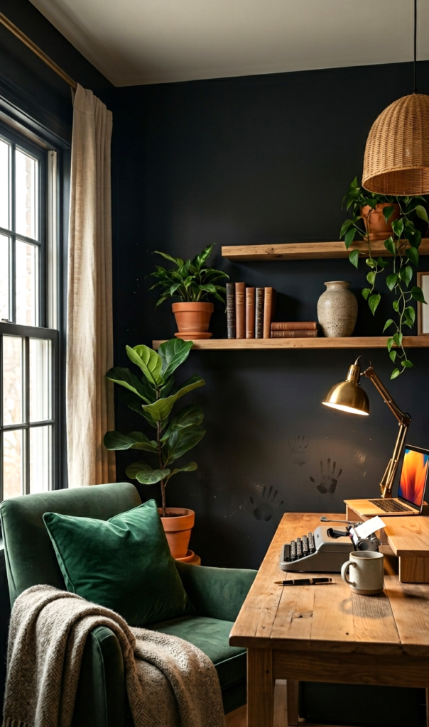
We are no longer afraid of dark rooms. Instead of charcoal gray, we are moving clients toward deep, ink-toned blacks that carry subtle brown or navy undertones.
- The Experience: When we wrapped a small home office in an ink-black shade last winter, the room instantly felt twice as cozy. It creates an illusion where the corners of the room disappear, making small spaces feel intimate rather than cramped.
- The Catch: Dust and smudges show up instantly on dark walls. If you have kids or high-traffic hallways, you must use a washable matte or durable eggshell finish, or you will spend your weekends wiping down fingerprints.
2. The Nature-Infused Sanctuary: Dark Sage & Forest Greens
Green acts as a neutral when done correctly. The current favorites are muted forest greens and deep sage shades that bring the outdoors inside.
- The Experience: Based on our testing across various living rooms, dark green stabilizes a space. It pairs incredibly well with natural oak furniture and brass hardware.
- The Catch: Green is highly sensitive to your window orientation. In north-facing rooms with cool light, a dark green can look incredibly moody and almost black. Always test a swatch on multiple walls before committing.
3. The Unexpected Cozy Vibe: Amber & Warm Ochre
This is the shade that surprises most of our clients. Amber is a rich, honeyed yellow-brown that feels incredibly nostalgic yet fresh.
- The Experience: We recently used a muted amber in a dining room, and the space instantly transformed under evening lamplight. It mimics a permanent golden hour vibe.
- The Catch: This color can easily lean “70s school bus” if the undertone is too bright. Look for an amber that has a heavy brown or gray base to keep it sophisticated.
[Insert Pinterest Pin: Warm Amber Dining Room with Accent Lighting]
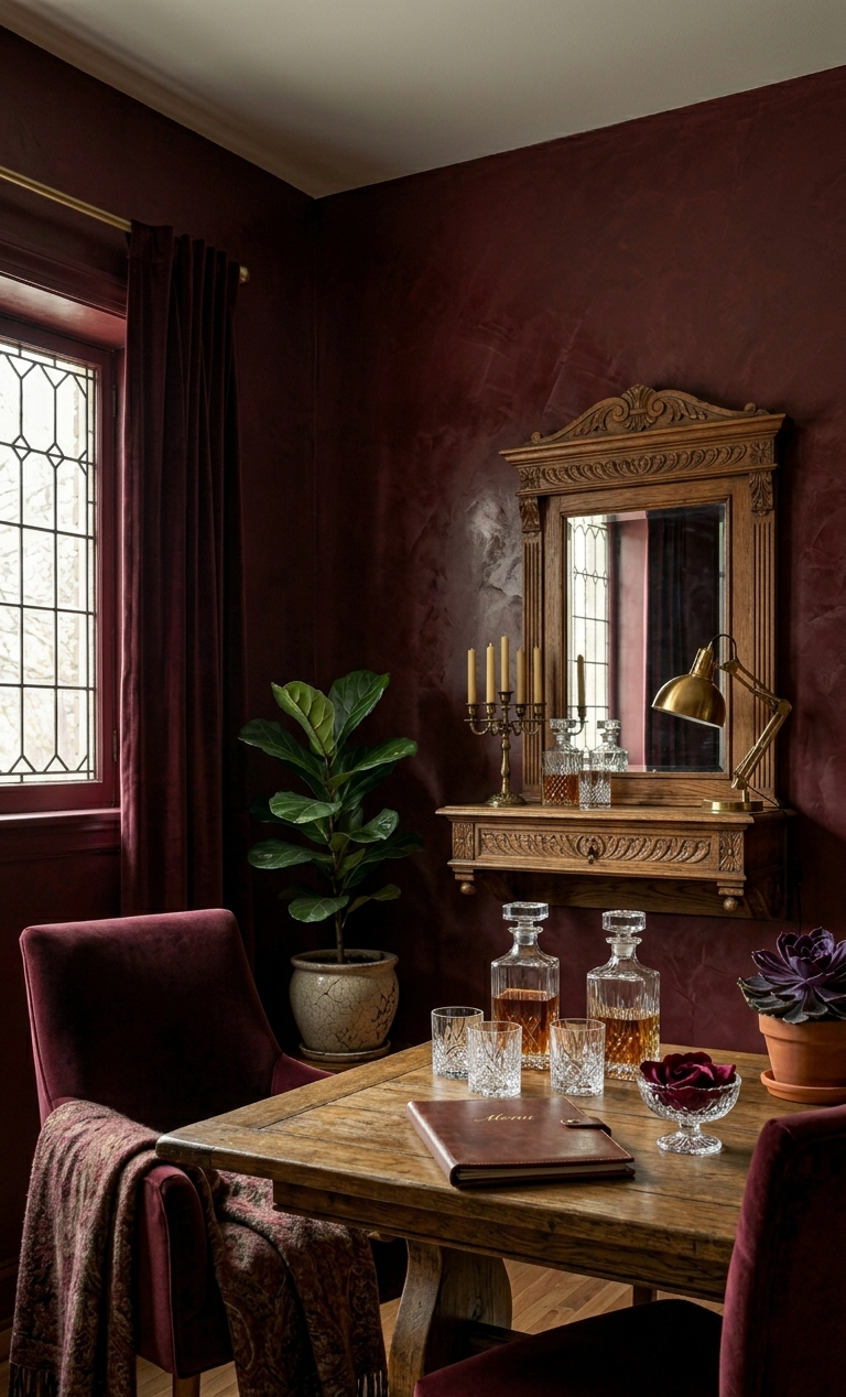
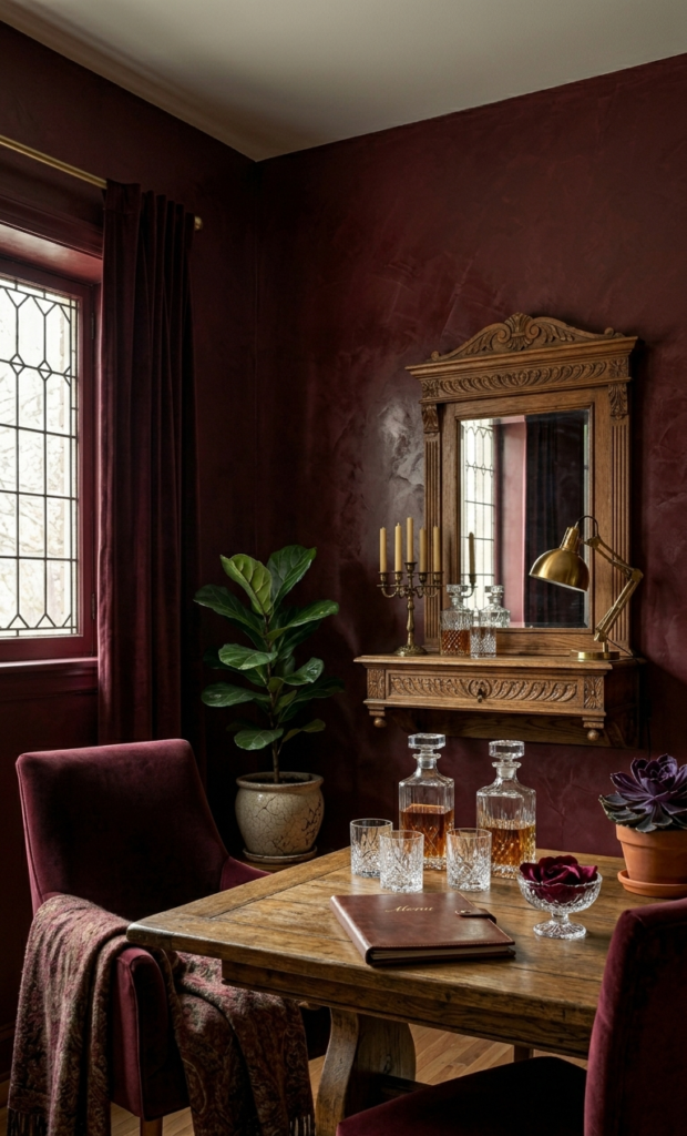
4. The Statement Maker: Deep Burgundy & Oxblood

Rich, wine-inspired tones are making a massive comeback in formal spaces like dining rooms, powder baths, and primary bedrooms.
- The Experience: Oxblood adds instant architectural weight to a home, even if you are working with standard drywall and no historic molding. It feels expensive.
- The Catch: Red-based tones have poor coverage. When we applied a deep burgundy shade on a recent project, it required three full coats plus a tinted primer to get an even, luxurious finish. Budget for extra paint.
5. The Gentle Alternative: Soft, Dusty Light Blue
If you love light rooms but want to move away from plain white, a dusty, pale blue with warm gray undertones is your best alternative.
- The Experience: It mimics the sky on a hazy morning. It keeps a bedroom feeling incredibly airy without making it feel cold.
- The Catch: Avoid anything with a pure primary blue base, or your adult bedroom will accidentally look like a nursery. The magic is in the gray and lavender undertones.
6. The Ultimate Chameleon: Blue-Gray-Green Blends
These are complex, muddy shades that look different depending on the hour of the day. It might look green at 9 AM, gray at 3 PM, and a soft slate blue by candlelight.
- The Experience: Our team uses these shades when a client wants color but is terrified of commitment. It is incredibly forgiving and pairs beautifully with linen fabrics.
- The Catch: Because it changes color constantly, it can make matching your rugs or curtains tricky. Pick your textiles first, then match this paint tone to them.
7. The New Neutral: Warm Mushroom & Taupe
If you want to keep your entire house cohesive and light, swap your cool gray for a warm mushroom taupe.
- The Experience: It provides the perfect backdrop for the raw wood and textured boucle furniture that are filling up our Pinterest feeds this year.
- The Catch: Watch out for pink or purple undertones. A taupe that looks perfect on a small paper sample can easily turn lavender once it covers an entire 15-foot wall.
How to Pick the Right Color For Your Space
Before you run to the paint store, look at your flooring and permanent fixtures. Paint is easy to change; your countertops and hardwoods are not.
| Paint Family | Best Room Placement | Best Lighting Match | Recommended Sheen |
| Almost Black / Deep Green | Home Offices, Media Rooms, Powder Baths | Low natural light (Lean into the moodiness) | Matte / Flat (Hides wall imperfections) |
| Amber / Burgundy | Dining Rooms, Entryways | Warm afternoon light / Accent lamps | Eggshell (Slight glow, easy to clean) |
| Mushroom / Blue-Gray | Kitchens, Living Rooms, Open Concepts | High natural light (Brightens the space naturally) | Satin (Great for high-traffic and moisture) |
How Do I Avoid Making a Costly Paint Mistake?
The biggest mistake we see homeowners make is buying paint based entirely on a tiny swatch or an internet photo. To get it right the first time, use this quick checklist:
- Never trust the store lighting: Flourescent store lights destroy color accuracy. Bring sample pots home.
- Paint large swatches: Paint at least a $2\times2$ foot square on two different walls—one that gets direct sunlight, and one that stays in the dark.
- Watch it for 24 hours: Look at the swatches in the morning, afternoon, and at night with your artificial lamps turned on.
Color is a tool to make your home feel alive. Don’t be afraid to step away from the safety of gray and experiment with shades that tell a story about who lives inside the house.
Read More : How to choose a kitchen colour schemes and understand color